Monday, December 3, 2012

Art in Media: German Foundation for Monument Protection

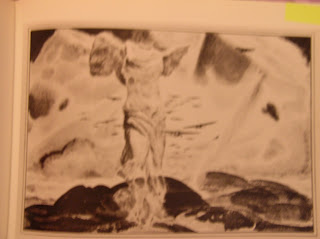
     “In an absolutely stunning campaign for the German Foundation for Monument Protection, Ogilvy Frankfurt placed life-size replicas of medieval statues around the city, right where you'd usually expect to find a homeless guy. Except instead of little signs saying, ‘Need money for food,’ the gnarled looking statues have signs propped in front of them that say, ‘My cathedral needs help’” (Skenazy, 2008). The images below are photographs of the installation.


     One of the reasons that this particular campaign is so effective is that it makes logical connections for the viewer and finds a way to ever-so-quietly find its way through the clutter of advertising that exists in most western countries. Most of the major cities in Europe are filled with buildings that are centuries old and many of them have been repurposed for modern uses. While these feats of architecture are considered as pieces of art to be marveled at by Americans and tourists from other countries, residents fall into the habit of allowing these pieces of history to fade into the background because of their lack of novelty after repeat viewings. (It happens in lots of places--is there a monument or landmark in your hometown/city that's cool for everyone who visits but is boring to you because you've seen it a hundred times? The same can be said for these artistic structures) This campaign to raise funds for the German Foundation for Monument Protection uses reproductions of art to catch a passerby’s eye and force them to take a second look at the scenery and realize that these buildings need to be cared for in order to survive. Also, the campaign takes these sculptures out onto the streets with the printed plea and helps to expose the German public to replicas of artworks that they might not otherwise be exposed to.
Skenazy, Lenore. (2008 November 10). You call it nontraditional advertising, but I call it art. AdAge. http://adage.com/columns/article?article_id=132308

Art in Media: HP & The National Gallery

     In the summer of 2007, The National Gallery in London embarked on an outdoor media campaign to publicize its collection of famous works of art (specifically paintings) in a new and inventive way. The museum partnered with the technology company HP (Hewlett-Packard) in order to craft reproductions of the works of art which they wished to publicize and to then find a unique way to display them. Digital copies of over forty different paintings were framed in traditional, large gilt frames and then hung on the outer-walls of buildings throughout the streets in London. Several audio walking tours were also compiled as a way to seemingly re-create the museum experience in the streets, while adding an educational element (and just a pinch of hide-and-seek since the works were interspersed with functional buildings and places of business). See the following link for a list of the different type of tours.


One interesting aspect of this tactic is the way in which people interacted with the art once it was in an outdoor setting.

Some people were surprised to see museum-quality works on ordinary brick walls

Some people completely ignored the pieces and allowed them to fade into the background as they went about their busy days

And some people believed that the works were literally FOR the people (This work was stolen)

     I have to say that I was just so incredibly moved by this exhibition. The idea is so smart and fulfills the goals of both companies involved. I am almost certain that if I had known of its existence, I would have felt compelled to hop on a plane and tour the streets of London, searching for each of the forty-four digital canvases. As someone who dislikes museums for all the restrictions they put on the way in which people are allowed to interact with fine art, this exhibition seems like the perfect solution. People were able to visit these canvases 24 hours-a-day, any day of the week, during the twelve weeks of the exhibition, without the threat of entrance fees and crowds (at least no more than there already are on the streets of London). People were able to approach each canvas without the fear that a guard would limit their distance or that an alarm would go off if one stepped too close. People could take as many pictures as they wanted without the fear of damaging the works because they were only reproductions and yet each piece was a one-to-one copy, so that the paintings were experienced in true scale. And even better, you could eat, yell, play music or run around with writing utensils near the canvases because they were not in museums and there was no code of conduct or risk of damage to property. What better way to gain more exposure for the National Gallery and each of the artists featured, than to present pieces in a way so that absolutely anyone felt they were worthy enough to view them? Absolute genius! A+

(2007 October 4). HP shows off its copiers with iconic artwork: Media buy also promotes London’s National Gallery. AdAge. http://adage.com/mediaworks/article?article_id=120913

Art & Ads = So What?

     Now that you've seen all of these examples of how fine art has been used in advertising, we must ask the question: So What?
     The biggest takeaway is the fact that regardless of the reason for the fusion of the two disciplines, all of the previous examples require some knowledge on the part of the consumer. Michelangelo's gigantic sculpture of David in Levi's doesn't have the same effect if the viewer doesn't know that the sculpture is actually nude, or that David is revered for his physical form as being a "perfect male". Understanding that da Vinci's Mona Lisa is surrounded by people and tourists constantly during all hours which the Louvre is open adds to the effect of the joke in the Sony ad that claim she needs time off to sleep. Being familiar with either stories or scenes of the annunciation where in Chrisitian religions it is told that the Virgin Mary is made aware that she has been part of an emaculate conception helps the viewer to realize exactly how ridiculous it would be for a ancient Biblical figure to have used a modern pregnancy test. And furthermore, none of Dick Detzner's "Corporate Sacrilege" pieces would be anywhere near as shocking if people seeing them were not familiar with the scenes from religious art that he portrays OR the advertising mascots that he uses to populate them.
     All of these examples of advertising and fine art melding are so much more powerful when viewers are "in on the joke". It would therefore appear that regardless of any other goals, such as social commentary, or breaking through advertising clutter, that artists and advertisers have for incorporating aspects of the other discipline, all of them assume a knowledgeable individual viewing them and understanding the nuance of the references.
     The posts that follow are examples of advertising where fine art is used but where the medium in which the marketing is placed is what makes the pieces stand out and important.

Ads by Fine Artists (Historic)

     At the beginning of the twentieth century, illustrated print advertisements were a new way for fine artists working at the time to earn money in order to further their creative endeavors (as the majority of artists cannot live merely off the earnings of their work). Advertising agencies were happy to provide employment for artists and to put their talents to good use selling products. Dave Saunders explains in his book 20th Century Advertising that “In many cases advertising has played patron of the arts, encouraging new artists and providing lucrative outlets for established painters…The benefits are reciprocated when the product gains credibility and respectability from the unstated endorsement of the artist” (Saunders, 1999, p. 188).

     The most well-known artist working in the first half of the twentieth century who lent his hand to the creation of ads was Norman Rockwell. His distinctive style and depictions of the American public were used in the below Massachusetts Mutual, Sears and Kellogg’s brand ads. Each ad shows a young, white individual, either as part of an entire family, such as in the print ad for insurance or the Sear’s catalog, or as an individual to represent all who eat the brand, such as the brunette girl with a large blue bow in her hair eating Grape Nuts, and the well-tailored young man eating his Shredded Wheat. Although these advertisements from the 1920s precede Rockwell’s fame, merely seeing an artist’s name signed at the bottom of an ad lent credibility to the company by association, as Saunders states above. Similarly, after Rockwell’s career took off and his fame increased, each company was able to own the rights to a piece of fine art and could reproduce the ads in a new context.


Saunders, Dave. (1999). 20th Century Advertising. London: Carlton Books Limited.

Fine Art about Advertising: Dick Detzner "Corporate Sacrilege"

     Dick Detzner, an artist working in the present day, creates paintings that are known for juxtaposing religious scenes and tropes from Medieval and Renaissance art, with characters from modern-day American consumer culture. The images below are examples of works from this series of paintings entitled “Corporate Sacrilege”. 
     The first is entitled St. Snugglebear and is based off of the numerous canvases of St. Sebastian, the biblical figure who is often depicted during his death, as tied to a tree and shot at with arrows. However, in this reproduction, instead of the Christian martyr, we find Snuggle Bear, the mascot for Snuggle Fabric Softener, tied to the tree instead, with a golden halo emanating from his head. Most unsettling is the fact that the character retains his famous smile and appears not to notice the arrows which protrude from his body. 
   

St. Snugglebear
      The second image is entitled The Last Pancake Breakfast and is composed to mirror The Last Supper, with Christ and his Twelve Disciples switched out for thirteen product mascots/cartoons seated at the long table. Aunt Jemima, the female bottle of maple syrup who represents the company of the same name stands in for Christ, and Captain Crunch appears as the figure of Judas. All of the characters chosen by Detzner are representatives of brands of breakfast food (maple syrup, cereal, oatmeal, etc) which was likely the fact because as Barry Hoffman states in his book The Fine Art of Advertising, “Da Vinci’s Last Supper offers a perfect setting for any company that wants to draw attention to mundane mealtime products” (Hoffman, 2003, p. 34). Therefore, it would seem that Detzner is following this trend but for the opposite purpose: the focus is on the fact that these brand symbols and mascots are revered like high religious figures, especially those which represent breakfast products.

The Last Pancake Breakfast
     The next two images are likely very legible to most viewers as they depict figures emulating Christ on the cross during and after the Crucifixion. In the first, it is the Pillsbury Doughboy who represents Christ, with a large finger slowly approaching his stomach as though to poke it and force him to emit the famous noise of glee which is also the title for the work. In the second piece, it is Ronald McDonald being crucified on the retailer's famous golden arches as the Hamburglar and Grimace raising their arms with expressions of grief, as the friends and family of Christ are usually doing in classical depictions of The Lamentation. As with Saint Snugglebear from above, the Pillsbury Doughboy and Ronald McDonald retain their same iconic smiles, despite spikes being driven through their palms. They seem completely unaware or even pleased with themselves that they are being revered in the same light as Jesus Christ.

Yee Hee Hee!

The Lamentation
      The final canvas, entitled Original Sin copies the structure of depictions of Adam & Eve prior to their exile from the Garden of Eden after their inability to avoid temptation. However instead of the nude figures of Adam and Eve, naked Barbie and Ken dolls stand in instead. In commercialized culture, it seems there would be no more fitting couple to represent the first man and woman on earth, according the Bible. In all of his canvases, Detzner uses stark lighting techniques to add to the eery sense of constant happiness of the faces of the brand mascots and drawing even more attention to how out-of-place they appear in high-religious settings.

Original Sin

     I have prints of both Original Sin and The Last Pancake Breakfast hanging in my apartment and hold the dual happiness of seeing advertising mascots that I so cherish held in such regard as to be placed in the shoes of famous fine art figured; as well as the horror of the sacrilege that probably should be felt as religious figures are made such complete fools of. But that's the debate that has been had and the sentiments that have been expressed for decades whenever advertising and fine art combine. Interpretation is up to each individual viewer? What do you think? Impressive or Offensive?

Hoffman, Barry. (2003). The Fine Art of Advertising. New York: Stewart, Tabori & Chang.

Fine Art about Advertising: Andy Warhol "Pop Culture"

     Artists who incorporate advertisements into their works of art usually fall into two categories: ones who attempt to revere the brands by placing them in a fine art context and ones who attempt to somehow degrade the brands by placing them in contexts in which they do not belong. Each uses their art as a way of making a statement about the country/world and in this case, consumer culture in general.

     Probably the most famous artist who centered his work around consumer culture and advertising was Andy Warhol. He reached his level of international fame through his paintings and silk screens that copied the labels of major brands like Campbell’s and Coca-Cola, examples of each are shown below. He incorporated brands without their consent and not at their request. He did not place them in any context that obviously satirized them (as can be seen below with Detzner’s work in the following post). Instead, he merely reproduced them by taking actual labels, such as a the one shown below and presenting them as his own (in this instance, through the appearance of his signature) or by silk screening images of them and showing them in repetition. His work was more concerned with the clash between fine art, which is seen as one-of-a-kind pieces that are worth a great deal and meant to be revered, with advertising, and items which are artifacts of consumer culture, which are by definition commodities and one of many. Warhol pleased himself a great deal by attempting to make the common uncommon, through the slightest manipulation, in the hopes that the new context would make people think twice about both art and pop culture.


Ads + Art = Parody (Modern)

     Another example of advertisements which parody famous works of art, of which there are many variations due to the famous nature of this work, is the ad shown below for a small sweatshirt company. The visual is of an elderly man and woman, standing in front of a farmhouse, as the man holds a pitchfork. This is a direct parody of Grant Wood’s painting American Gothic. The composition is immediately recognizable to the viewer and the connection is quickly made. 


     Unfortunately, it is often parodies such as these which cause art historians and critics to roll over in their proverbial graves because they believe that using works of art to aid capitalist products is sacrilege. However, Johanna Drucker in her article "Who's Afraid of Visual Culture?" argues that "The theoretical discussion of fine art as a cultural practice is still largely dependent on outmoded ideas that 'art' defines itself in critical opposition to mass culture. Clearly there is a problem here. The gap between the reality of artists' sensibilities and the theoretical apparatus of much (especially academic) art criticism suggests that the understanding of the relation between fine art and visual culture needs a major conceptual overhaul more in keeping with what's actually going on" (Drucker, 1999). Seems the art world needs to accept that these two realms, the artistic and the commercial can and will cross paths in the future.

Suggested Target Audience: Adults in Central U.S. States
Suggested Modern-Day Media Vehicle: Midwest Living Magazine or Midwestern Family Magazine or local newspapers in Midwestern cities and counties.
Rationale: The prototypical middle-American farm image may resonate more with those closer to a life that actually requires a pitchfork daily, and in climates where heavier clothing is necessary.

Drucker, J. (1999). Who's Afraid of Visual Culture?. Art Journal, 58(4), 36+.

Ads + Art = Parody (Historic)

     Instead of using pieces of fine art as readymade materials for print advertisements, sometimes advertising agencies use the composition of famous works of art and architecture as inspiration for their own ads. A campaign from the 19-Auts for Ivory Soap exemplifies a simple way to incorporate a product into a work of art. The two ads shown below are from a campaign of print ads where the advertisers used the iconic image of bars of Ivory soap to “rebuild” famous landmarks from around the world (shown are representations of The Arc du Triumphe in Paris and the Great Pyramids in Giza).


     Perhaps the advertisers mean to insinuate that Ivory soap is so important to people and the world that it is literally the building block upon which great things are built, such as these structures. Maybe instead the advertisers were attempting to elevate the status of the brand, as discussed before, to bring it to the level of something worthy of praise and awe like the monuments. Whatever the motivation, the finished product is arresting and visually appealing.

Suggested Target Audience: Male and Female Cultured Travellers
Suggested Modern-Day Media Vehicle:Travel + Leisure Magazine Website
Rationale: Ads with monuments from around the world would likely more resonate with those who have traveled or would like to travel in the future.

Ads + Existing Art = Humor (Modern)

      While the composition of the Kellogg’s ad from the previous post allows the reader to ponder how the art itself (Venus personified) would interact with the product, the ad below suggests a way that the end consumer of the product can use it in a creative way to interact with a famous piece of fine art. The right-hand panel of the ad shown below reads: “New Handycam Stamina: Up to 15 Hours continuous recording”. The visual of the piece is of Leonardo Da Vinci’s famed painting Mona Lisa. The portrait is framed by white L-angles and the letters REC are seen at the top right-hand corner: these additions are to alert the viewer that we are seeing the painting through the lens of a Sony camcorder. However, what we see is not the painting as we know it—instead, Mona Lisa has her eyes closed and her head tilted forward. She is asleep! This Sony ad insinuates that a customer, with this camcorder, could potentially tape the painting long enough to see the subject “go off-duty” so to speak. This ad plays on the fact that this painting draws an almost never-ending crowd of viewers everyday, at its home in the Louvre art museum in Paris. A reader gets the joke not only in recognizing the piece, but also by understanding the culture that surrounds it.


Suggested Target Audience:Technologically-savvy individuals with higher education
Suggested Modern-Day Media Vehicle: Digital Photography Magazine Website (Website associated with print version of photography and videography website)
Rationale: Since the ad focuses on the product attributes that would likely only matter to someone using the equipment often, and since the ad relies more on the consumer perhaps having seen the painting in person, an individual with a little more education and a little more technical knowledge needs to be reached. 

     There are a large supply of advertisements which reproduce fine art and add copy or make small changes to the art to produce a humorous outcome. Due to the abundance of religious works in art history, they are an often-used genre. Below the reproduction of this advertisement in his book The Fine Art of Advertising, Barry Hoffman has written a comment: “Fra Angelico’s Annunciation depicts Gabriel giving Mary the news of her pregnancy. For those of us who experience intercourse with partners who are less than divine, this alternative pregnancy test will have to suffice” (Hoffman, 35). 
     The print ad has reproduced the 15th Century painting and given Mary a thought bubble of dialogue that reads, “Thanks, but I already know”. Below the reproduction is a picture of the product and the tagline: “The most efficient pregnancy test” (Hoffman, 35). Clear Blue Pregnancy Tests has used this painting as a way to suggest that their product is so effective and efficient, that it can even detect pregnancies from divine intervention. The joke is more accessible because of the religious nature of the painting—even if a consumer isn’t familiar with this exact work, it is likely that they’ve seen a depiction of an annunciation scene from another artist, or are just familiar with the exchange said to have taken place between Gabriel and Mary from religious lore. “Many of the paintings of religious scenes seem oblivious of the offense they may give to anyone who thinks that the need to sell a product doesn’t justify desecrating sacred images and icons” (Hoffman, 32). Hoffman’s comment brings to light that while art can be put into ads to produce a humorous outcome, it almost certainly means that the art object loses most of its prestige value in the process.


Suggested Target Audience: Women 18-40
Suggested Modern-Day Media Vehicle: Marie Claire, or similar women's fashion or lifestyle periodical
Rationale: Since pregnancy tests are most relevant to women, the ad must reach them exclusively

Hoffman, Barry. (2003). The Fine Art of Advertising. New York: Stewart, Tabori & Chang.

Ads + Existing Art = Humor (Historic)

     When pieces of fine art are chosen to appear in print advertisements, sometimes it is less about aligning a product/service with a piece that fits, and it is more about finding an unusual relationship between the content or composition of the art (or sometimes even the way that the art is viewed) and the product/service.

     A historical example of this tactic can be seen in the below Kellogg’s ad from 1911. This print piece, for the company’s Toasted Corn Flakes Cereal includes a picture of the Venus de Milo next to a box of the product. The Classical, marble sculpture is of Venus, the goddess of love, a common female represented in Greek art. Venus stands topless with a long draped skirt, however, due to the age of the piece (now almost two thousand years old) the marble has weakened so that the arms are no longer attached to the body of the sculpture. The tagline of the advertisement reads “If Venus had arms”. The placement of this statement insinuates that were the sculpture to still retain its upper-appendages, the goddess Venus would eat Kellogg’s Toasted Corn Flakes. This company chose to incorporate humor with fine art, in order to connect with consumers. Kellogg’s took something well-known that the general public saw as high class and juxtaposed it with a corn-based breakfast cereal.

Suggested Target Audience: Heads of Households making food purchasing decisions
Suggested Modern-Day Media Vehicle:TV Guide Magazine
Rationale: The appropriate vehicle would be one that does not include weighty articles, such as a newspaper or periodical like Time Magazine or The New Yorker. Instead, since the ad should just make you laugh, and doesn't require any art historical knowledge in order to make the content legible, the vehicle should be for the every-man when they are consuming non-serious content.

Ads + Existing Art = Class (Modern)

      Another example of advertisers trying to elevate the status of their products through the use of fine art can be seen in the Levi's ad below. This print piece is a lone, doctored visual without any body copy or even a tagline. The High Renaissance sculpture of David is an over-life sized representation of the biblical character at a young age, as conceived by the famed artist, Michelangelo. During the Renaissance, a number of archeological excavations were occurring which unearthed many pieces of Classical art and architecture, which informed the artistic sensibilities of artisans working at that time. One of the main tenets of Classical art which was studied and used during the Renaissance was the composition of the human form, portrayed in the nude, like David. However, with regards to the way that the naked human form is viewed in modern American culture, Barry Hoffman writes in his book, The Fine Art of Advertising, “The role of David [in modern advertising] is to give us something naked so we can make fun of the fact that male nakedness is forbidden” (Hoffman, 2003, p. 28). Much in the way that the Church placed fig leaves over many of the Classical pieces unearthed during the Renaissance, Levi’s has chosen to cover David in this ad with a pair of their denim cut-off shorts. Without having to print a single word, Levi’s is able to associate its jeans with what has become the iconic male form.


Suggested Target Audience: Middle-Class Men and Women
Suggested Modern-Day Media Vehicle: Outdoor Billboard in Central Location (U.S. Major Coastal City)
Rationale: While the Levi's brand is likely trying to elevate itself and insinuate that everyone "even someone as good-looking as David would wear Levi's" the brand itself is not high-end and so the vehicle must match the target AND the brand's aspirations. So it should be a mainstream outlet where striking visuals are common, such as fashion billboards.

Hoffman, Barry. (2003). The Fine Art of Advertising. New York: Stewart, Tabori & Chang.

Ads + Existing Art = Class (Historic)

     One of the most common ways in which fine art is used in advertisements is the method found in the Pear’s Soap ad shown in the previous post—the brand re-purposed an existing piece of fine art. This method has the advantages of being cost-effective by eliminating most of the work for designers and art directors, as well as by adding an arresting quality through the use of a well-known visual. In ads that use art this way, it is often to associate the product with the aura that the piece of fine art has earned over the years, without having to explicitly make the connection for customers.
     A historical example of this well-worn tactic can be seen below in the print ad from 1929 for the Ford Motor Company, during their short entrance into the aviation market. This black and white ad uses a superimposed image of the Nike of Samothrace over a scene of the ocean with planes flying overhead, so that the headless sculpture seems to rise out of the water. The Classical sculpture is portrayed as monumental in size, reaching from the ocean to the sky. It is important to note that the airplanes are not the centerpiece of the ad; instead it is the Nike, or the Winged Victory as she is also referred. She was used as a way to reference the beauty of flight because the sculpture is in a state of motion, either having just touched down or shown in the moment before take-off. This print ad requires the reader to make a further leap in terms of connection between the piece of fine art incorporated into the ad and the product that the advertiser is attempting to sell, than the reader would in a piece where the product is part of the ad. It appears that here Ford was attempting to sell the experience of flying, rather than a seat on a flight or a piece of aviation equipment and a sentiment, as nuanced as that, is better expressed through visuals that copy.


Suggested Target Audience:Wealthy, cultured individuals who care about experience of flying
Suggested Modern-Day Media Vehicle: STRATOS Magazine (Luxury Lifestyle Magazine focusing on wealthy individuals)
Rationale: As stated above, the sell is not overt and the beauty of flight is focused upon more than the specifics of the aviation product, therefore only those who can first afford the product can worry about the nuances of brand aura.

Art in Advertising: The Beginning

“Advertising is the greatest art form of the twentieth century.” –Marshall McLuhan

     The above quote by the well known communications theorist and writer, Marshall McLuhan, may be presumptuous and subjective, but it expresses a sentiment that became more prevalent as the twentieth century progressed that advertising was an actual art form. 
       The very first ad to include a museum quality piece of artwork was run by the Pear’s Soap Company in a campaign that ran from the late nineteenth to early twentieth centuries. The ad was adapted from a painting by Sir John Everett Millais, entitled A Child’s World. The painting depicts the artist’s grandson, a young boy, after he has just blown a soap bubble into the air through a clay pipe. The child stares up in wonder as the bubble floats just above his head. The Pear’s Soap Company bought the rights to the work and created a chromolithographed form, over which they placed a headline and body copy for the ad, as well as their logo on the bar of soap that lies at the boy’s feet. (Twitchell, 1996, p. 185). Several authors who write historically about art and advertising express that there was a great amount of dismay felt by the artist, and some of the general public, over the use of a piece of fine art painting in an advertisement meant to generate sales for a product. 

    
     While this sentiment is still present, there are a number of times when fine art and advertising have crossed paths, both historically and in the modern day, which will be explored here further. Sometimes advertisers use existing pieces of fine art in advertisements to elevate the status of the product or to make the consumer laugh. Other times artists use images and figures from advertising in their fine art to make a commentary about American consumerism. Whatever the interaction, when the two disciplines combine it is powerful and often unexpected.
     In the following posts, examples of each of these will be shown and discussed, and in addition, target audiences and appropriate modern-day media vehicles will be suggested for each of these placements based on what is believed to be the overall goal of the campaign.
Twitchell, James B. (1996). Adcult USA: The Triumph of Advertising in American Culture. New York: Columbia University Press.